Placing your data into cells in Excel provides you with ways that you can compare and interact with your data.
Typically this will involve various sorting options and formulas, but you can also create charts and graphs if necessary. You can even learn how to make a pie chart in Excel 2013 if you have a need for one.
A pie chart can be a helpful visual aid for displaying values in relation to one another. You may be able to tell relatively how large a number is in comparison to other values in a spreadsheet, but the ability to see each piece of data as an individual “slide” of a pie can be very helpful.
Our tutorial below is going to show you how to take two columns of data in an Excel spreadsheet and show that data as a pie chart.
How to Make Excel 2013 Pie Charts
- Open your spreadsheet.
- Select the data.
- Click the Insert tab.
- Select the Pie Chart button.
- Choose the desired pie chart style.
Our article continues below with additional information on making a piechart in Excel, including pictures of these steps.
Another thing you can do with your spreadsheet data is turn it into a table. Our create table in Excel tutorial can show you how to do this.
How to Create a Pie Chart in Excel (Guide with Pictures)
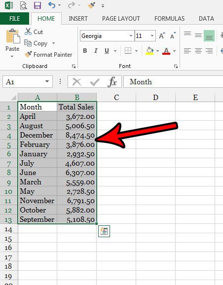
The steps in this article were performed in Microsoft Excel 2013. This guide will assume that you already have data in a spreadsheet, and that you wish to display that data as a pie chart. For the optimal display of data in a pie chart, it’s ideal to have two columns. One column with a label, and one column with data that will be displayed as the appropriately sized pieces of the pie. In my example below I am going to be displaying a pie chart that includes a column of months, and a column of the total sales for that month.
Step 1: Open Microsoft Excel.
Step 2: Select the data that you want to include in the pie chart.
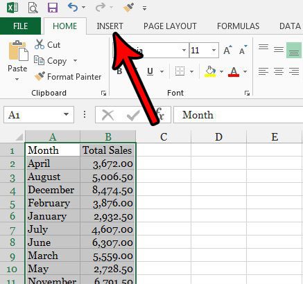
Step 3: Click the Insert tab at the top of the window.
The Insert tab is where you will find some other useful tools that let you add things like a picture, a text box, a pivot table, and more.
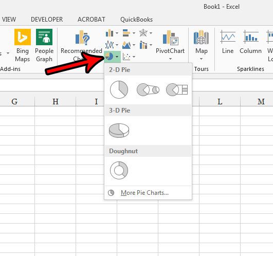
Step 4: Click the Pie Chart button in the Charts section of the ribbon, then choose the pie chart style you want to add to your spreadsheet.
Note that this Charts group in the ribbon has a variety of other types of charts or graphs that you could create instead. If a pie chart isn’t what you need, then you can simply click a different chart type and see if it provides the visual data layout you require.
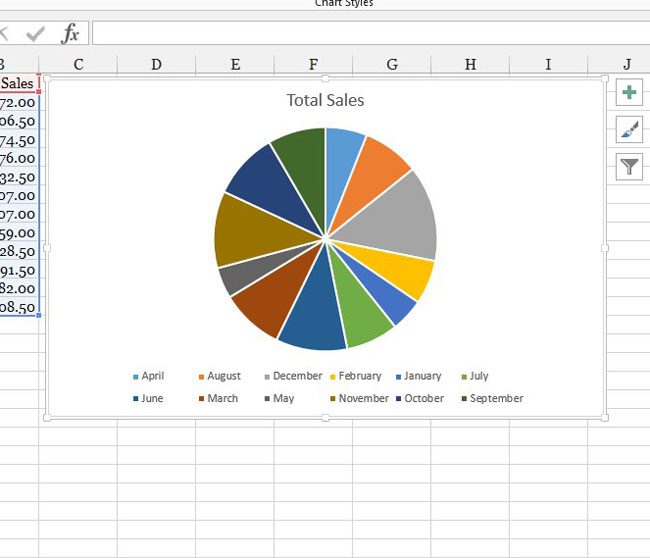
You should now have a pie chart displaying your selected data. My pie chart is shown in the image below.
Our article continues below with additional information on working with Excel pie charts.
More Information on How to Make Pie Chart in Excel 2013
If you click the paint brush tool to the right of the chart, you will see a couple of other options for how you can display your data. For example, in the image below I chose to display the data with a percentage of the total overlaid on each pie slice.
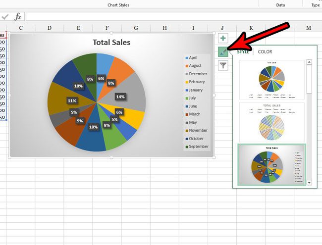
Excel offers a handful of various 2D pie chart options, as well as a 3D pie chart option and a doughnut chart option. These different chart options are visible when you click the pie button in the Charts group on the ribbon. If you need to use a pie chart other than the ones that are shown on the pie chart drop-down menu, then you can click the More Pie Charts button at the bottom of that menu.
Some of the other pie charts available after clicking the More Pie Charts menu include “Pie of Pie” and “Bar of Pie.” The layout of these charts will split some of the smaller pie slices from the main pie chart and show that as their own pie chart next to it.
Your chart is going to have some circles on its border that you can drag if you want to make the chart taller or wider. If you choose one of the corner circles then it will expand the chart while keeping everything at scale.
If you click the chart, you will see a Design tab and a Layout tab at the top of the window. Choosing the Layout tab provides you with ways to add some needed chart options to the chart, such as labels for your x-axis and y-axis, you can format data labels, and you can even edit the chart title.
If you need to use your pie chart in another Microsoft Office application like Microsoft Word or Microsoft Powerpoint then you can right-click on the chart and choose the Copy option, then simply paste it into the desired document.
One other useful way to sort and organize data in Excel is with a table. Find out how to make a table in Excel so that you can easily sort, filter, and format the data in your spreadsheet.

Matthew Burleigh has been writing tech tutorials since 2008. His writing has appeared on dozens of different websites and been read over 50 million times.
After receiving his Bachelor’s and Master’s degrees in Computer Science he spent several years working in IT management for small businesses. However, he now works full time writing content online and creating websites.
His main writing topics include iPhones, Microsoft Office, Google Apps, Android, and Photoshop, but he has also written about many other tech topics as well.